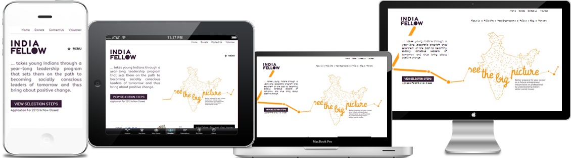
More and more number of website owners are queuing up getting their websites designed in a responsive style. The growing usage of such style is due to the fact that people are becoming tech-friendly and are using a variety of devices like tablets and smart-phones apart from regular PC’s and laptops to access the websites.
It is mainly the usage of fluid design which is the backbone of creating a responsive website design as it can help the website respond to the size of the screen and adjust itself accordingly. Thus, whether it is iPhone or desktop monitor, the view of the screen will always be user friendly.
Whatever be the configuration of the screen display, the view of the website is likely to prove stunning. The major advantage of such website is that it saves a lot on your pocket over a long term, the main reason behind this being one site and an ‘n’ number of deployment possibilities. The otherwise presence of inconsistency of images and content will lessen to a large extent. Moreover, our responsive websites development are SEO friendly which means that they top on Google search results page.
The creative designers at our end will work with you and listen to all your problems and take every precaution to take care of all of your needs. We just don’t talk about our achievements but really mean them.
Benfits of Responsive Website
Super Flexible: Content will move like a fluid from devices to devices of wither resolution. You can see the grids and images move freely which gives you an easy access to the website on any device.
Excellent User Experience: Users will find it easy to read the content and see images easily on their tabs, desktops or mobiles. Every user is able to find the data of their own choice available without fixing its size.
Cost Effective: By going for one website, you can save much cost than investing in two. It offers great navigation to the customers and they can click it in either devices they carry.
It is Recommended By Google: Google also recommends the same because the website have one URL and one HTML which makes it easier for Google to crawl and organize data. Also, it is very easy to share data.
Very Easy to manage: It is very easy to manage if you have one responsive website and one SEO. This saves much time and allows the mobile to use the same information to provide to the users. Running two SEO campaigns at the same time creates mess.